FMCG • Ayurvedic Products

OM DHATU

SCOPE OF WORK

INDUSTRY

YEAR

BRAND OVERVIEW

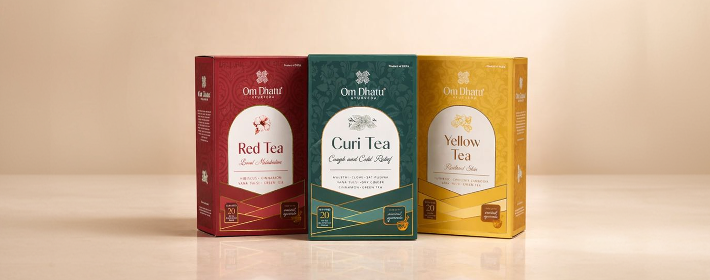
Om Dhatu Ayurveda was reimagined to balance traditional Ayurvedic wisdom with a modern, premium sensibility.

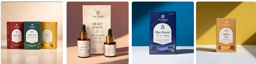
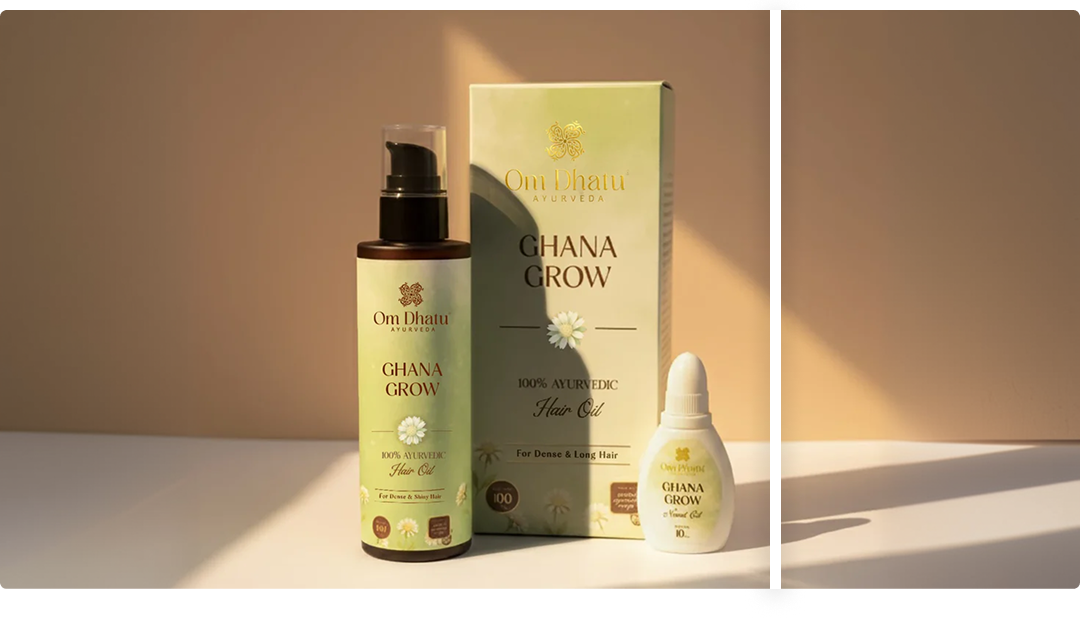
The visual identity combines a rich, earthy palette with gold-accented geometric patterns, clean typography, and structured layouts to convey purity, balance, and trust, while subtle botanical cues highlight its natural roots.

The result is a cohesive, shelf-strong brand that feels contemporary yet deeply rooted in wellness and heritage.

Challenge

The brand needed a more modern, premium identity without losing its Ayurvedic roots.

Solution

A refined visual system using earthy colours, clean typography, and subtle traditional cues brought clarity, consistency, and shelf appeal.

Visual Identity

LOGO:

The Om Dhatu Ayurveda logo symbolises balance and holistic wellness through a refined, minimal emblem, blending Ayurvedic roots with a clean, premium aesthetic.

Main Logo

Secondary Logo

Secondary Logo

COLOR PSYCHOLOGY :

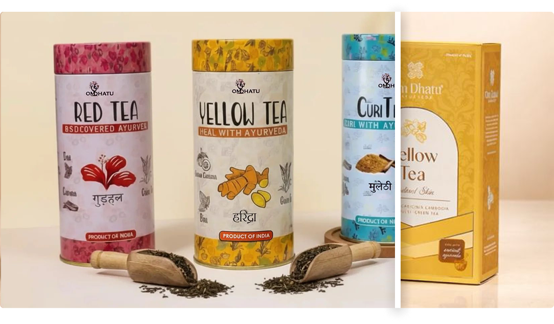
The colour system uses warm, earthy tones with controlled accents to create a sense of balance, trust, and natural wellness. Consistent colour coding across variants improves clarity and recall, while the muted palette keeps the brand calm, premium, and cohesive.

Branding

Rebranding

OTHER PROJECTS YOU MIGHT LIKE