FMCG • Cutlery

KALAVINKA

SCOPE OF WORK

INDUSTRY

YEAR

BRAND OVERVIEW

Mdurability, and refined design for modern kitchens.

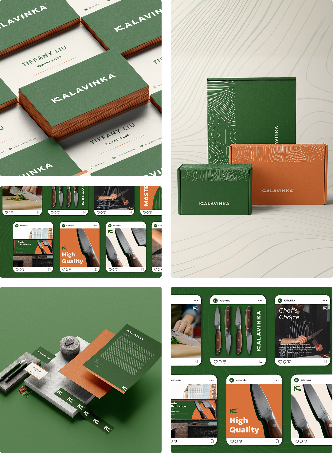
Positioned as functional yet elevated, it appeals to users who value both performance and aesthetics, with a visual identity reflecting confidence, craftsmanship, and product reliability.

Clean layouts, bold details, and a structured design language give a professional edge, while thoughtful styling keeps it approachable, creating a premium, practical brand built for everyday use.
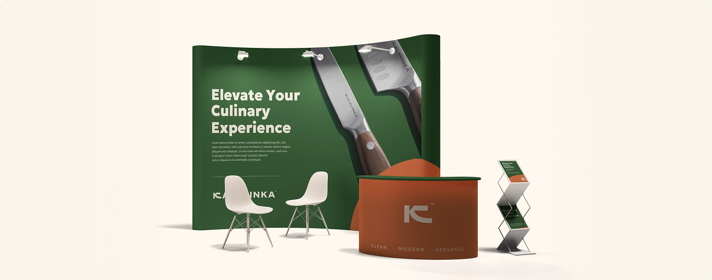
Challenge

To create a cutlery brand that feels professional and high-quality while still remaining approachable for everyday use.

Solution

A bold, minimal identity using strong typography and structured layouts for consistency across all touchpoints.

Visual Identity

LOGO:

The Kalavinka logo is clean and assertive, expressing strength, precision, and reliability through a minimal, scalable form.

Main Logo

Alternate Logo

Alternate Logo

COLOR PSYCHOLOGY :

Deep, grounded tones with clear contrasts convey durability and craftsmanship, while consistent colour blocking enhances shelf clarity and brand recall.

Main Logo

Alternate Logo

Alternate Logo

Branding

OTHER PROJECTS YOU MIGHT LIKE