FMCG • Jewellery

MORPHO

SCOPE OF WORK

INDUSTRY

YEAR

BRAND OVERVIEW

Morpho is a refined jewellery brand celebrating timeless elegance and quiet luxury, rooted in the belief that true beauty needs no excess.

The identity blends classic craftsmanship with contemporary sensibility, using thoughtful visuals and a restrained aesthetic to feel graceful, modern, and enduring.

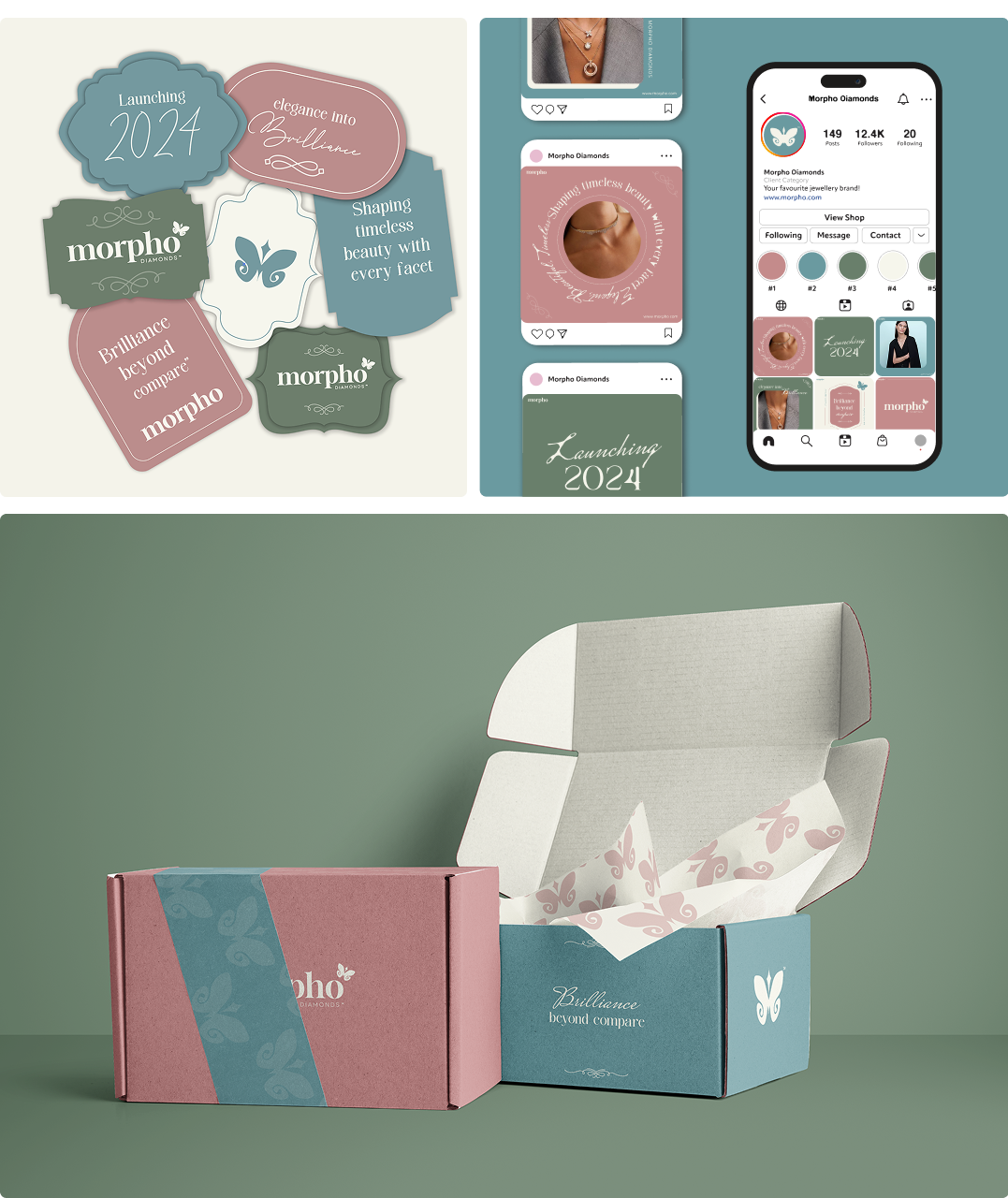
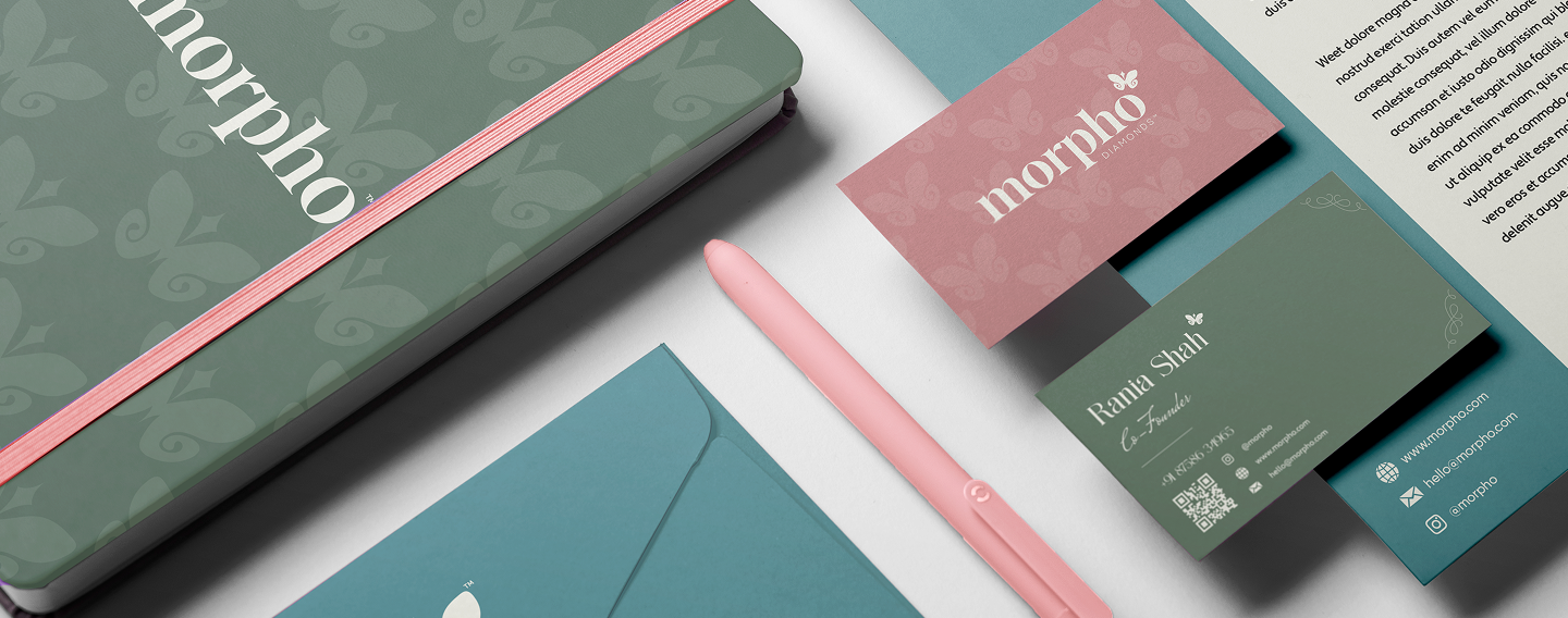
From packaging to print and spatial applications, every touchpoint is intentional, balanced, and elevated, creating a cohesive brand experience that reflects sophistication, precision, and understated confidence.

Challenge

To design a jewellery identity that feels premium and aspirational without appearing loud or over-ornamented.

Solution

A refined visual system using elegant typography and subtle details to maintain a timeless, premium appeal.

Visual Identity

LOGO:

Inspired by the butterfly, the Morpho logo symbolises transformation and enduring beauty, expressed through a delicate, symmetrical form that reflects precision and craftsmanship.

Main Logo

Alternate Logo

Alternate Logo

COLOR PSYCHOLOGY :

A palette of cool jewel tones and soft neutrals conveys luxury and calm confidence, while consistent application across packaging builds strong recognition and a cohesive premium feel.

Branding

OTHER PROJECTS YOU MIGHT LIKE