FMCG • Food

NOSCA

SCOPE OF WORK

INDUSTRY

BRAND OVERVIEW

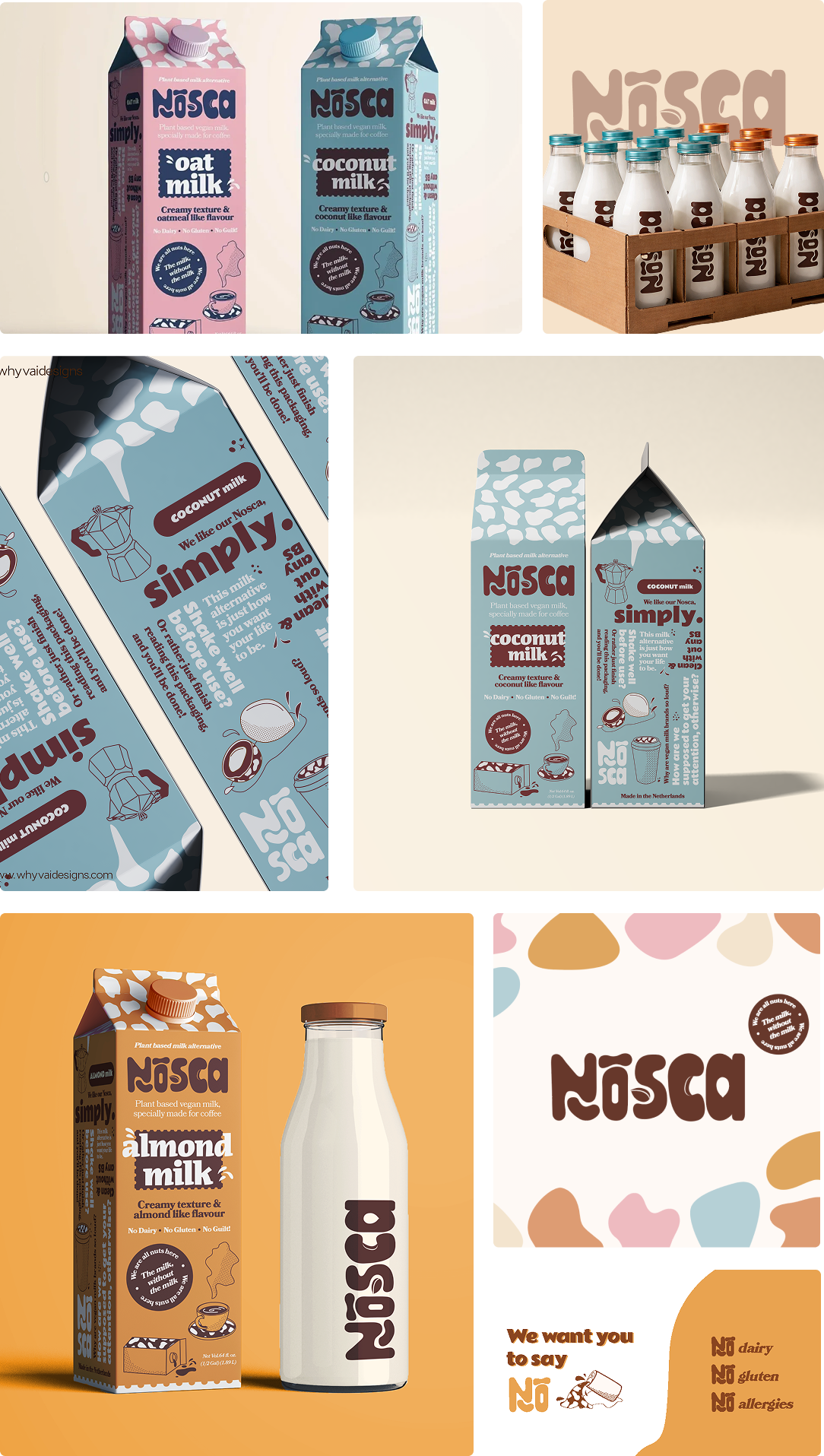
Nosca is a plant-based milk brand built around simplicity, warmth, and conscious everyday choices. It makes vegan milk feel familiar and approachable, steering away from technical or preachy narratives.

The visual identity blends softness with clarity through rounded typography, playful forms, earthy colors, and hand-drawn illustrations, creating a warm, human feel.

The branding system spans packaging, variants, and all touchpoints, ensuring strong consistency and shelf recognition while reinforcing Nosca as an easy, everyday choice.


Challenge

Plant-based milk branding often feels cold or preachy, making everyday adoption harder in a crowded category.

Solution

Nosca uses warmth, playful typography, and a clear visual system to make vegan milk feel simple, familiar, and approachable.

LOGO:

The Nosca logo uses soft, rounded letterforms and subtle imperfections to feel warm, human, and friendly, reinforcing simplicity at first glance.

Main Logo

Alternate Logo

ILLUSTRATIONS :

The illustrations add warmth and personality through soft, playful forms, making the brand approachable while differentiating variants with a human touch.

Branding

OTHER PROJECTS YOU MIGHT LIKE