FMCG • Cleaning

THE BIG THREE

SCOPE OF WORK

INDUSTRY

YEAR

BRAND OVERVIEW

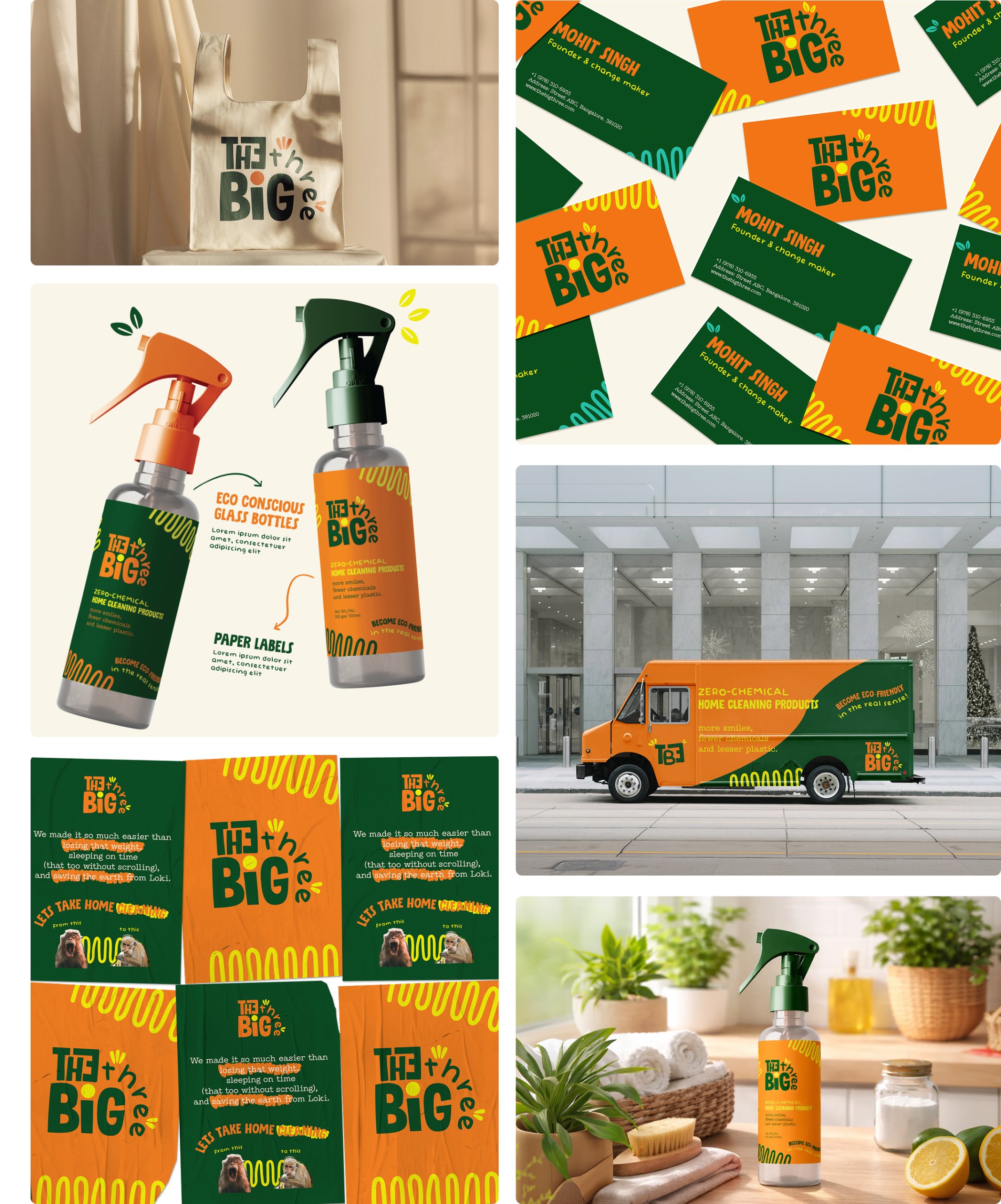
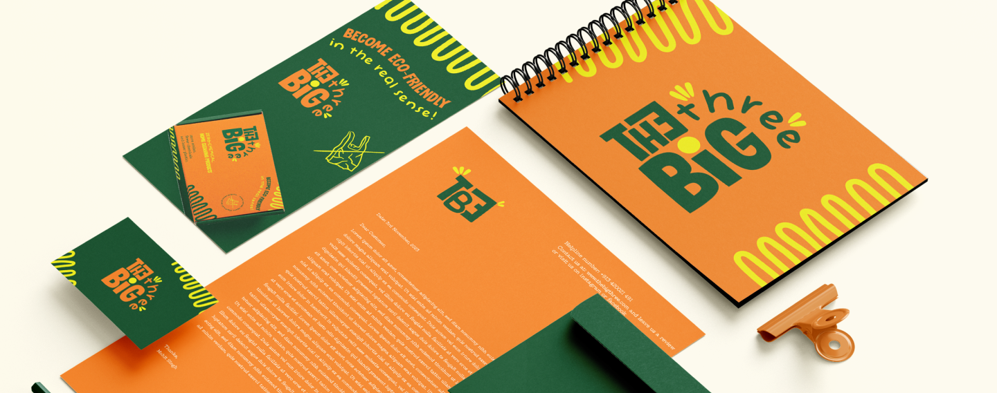
The Big Three is a zero-chemical home cleaning brand that brings bold optimism to everyday action, reframing sustainability as loud, confident, and approachable.

Bright colors, playful typography, and a flexible system create strong recognition across all touchpoints.

The result is a high-energy brand that makes conscious cleaning simple, memorable, and fun.
Challenge

Eco-friendly cleaning brands often feel dull or overly serious, failing to stand out or excite everyday users.

Solution

A bold, high-contrast visual identity that turns sustainable cleaning into something confident, joyful, and instantly recognisable.

Visual Identity

LOGO:

The Big Three logo uses playful, chunky type to feel bold, friendly, and energetic, reinforcing the brand’s optimistic spirit.

Main Logo

Alternate Logo

Alternate Logo

ILLUSTRATIONS :

The illustrations use bold, playful forms to add personality and energy, reinforcing the brand’s fun, optimistic tone across touchpoints.The Big Three logo uses playful, chunky type to feel bold, friendly, and energetic, reinforcing the brand’s optimistic spirit.

Branding

OTHER PROJECTS YOU MIGHT LIKE